
|
|
|
|
#1 |
|
Участник
|
crmtipoftheday: Tip #1101: Add a scale break to charts
Источник: https://crmtipoftheday.com/1101/add-...eak-to-charts/
============== Whenever you have a chart that combine very high and very low values, it can be difficult to assess individual columns. For these situations, you can add a scale break to the chart. Adding a scale break gives you a better view of how the comparative segment are doing against each other, but you will lose some detail on how those segments are positioned in context of each other. Make sure you are only using this feature when relevant. As usual, we will bypass the export, manual editing, and the import of the chart XML and just open the chart in the Advanced Chart Editor for the XrmToolBox. Right click on the axis where you want to apply the scale break. This would almost always be the Y axis. 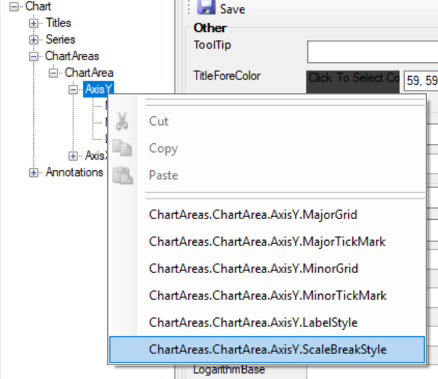 Insert the scale break. In theScaleBreakStyle node options make a selection in the following settings. 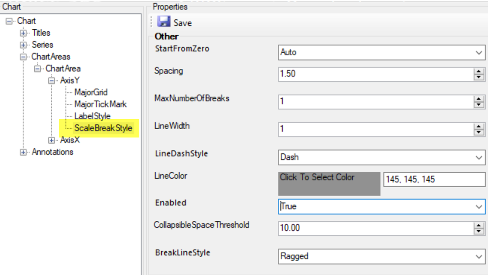 Not all the settings are required, but make sure Enabled is always set to “True”. Remember to click Save and the update the chart. 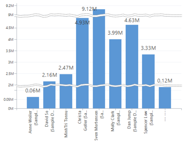 Scale breaks are great for emphasizing differences for similar values within a mixed set. If you have a set of data in a bar or column chart where all the values are very high with subtle, but important variations you can start the axis at a value that is not zero.  Instead of adding a scale break to the Y axis, find the property called IsStartedFromZero and set the value to False. 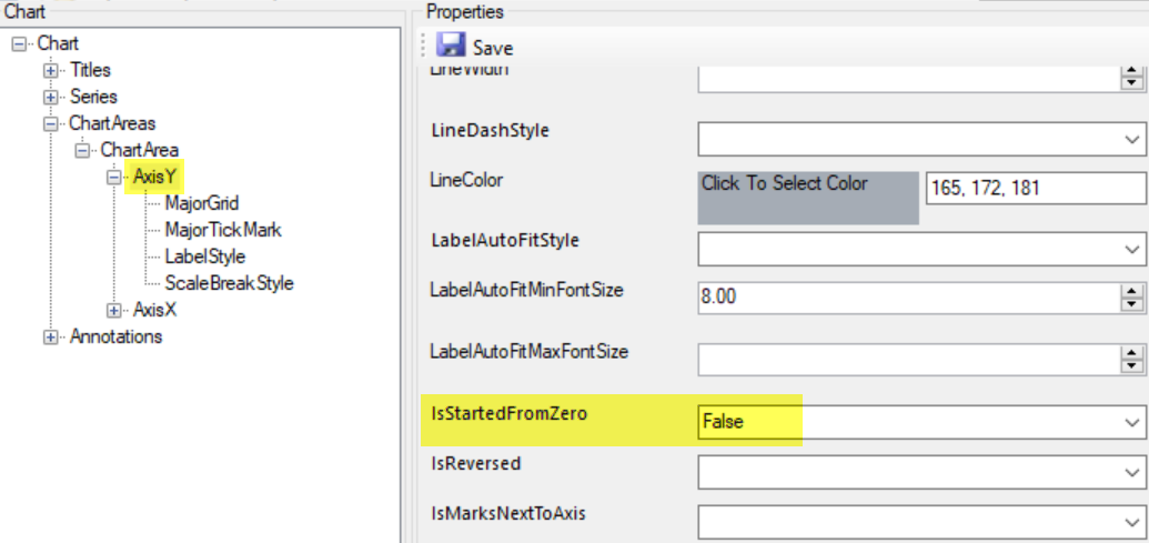 Then save and update the chart. 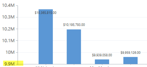 Now you have a chart where the variations in the values are easier to identify. It is possible to set your own starting value on the axis directly, but this property automatically identifies the best starting value. While you could use this property in conjunction with the scale break, it would be poor practice in most cases as the properties serve different purposes. When using the IsStartedFromZero = False option, we recommend either emphasizing the values on the axis itself, or adding an annotation notifying the user that this axis has a different starting point. Источник: https://crmtipoftheday.com/1101/add-...eak-to-charts/
__________________
Расскажите о новых и интересных блогах по Microsoft Dynamics, напишите личное сообщение администратору. |
|
|
|
|
| Опции темы | Поиск в этой теме |
| Опции просмотра | |
|